
Abstract
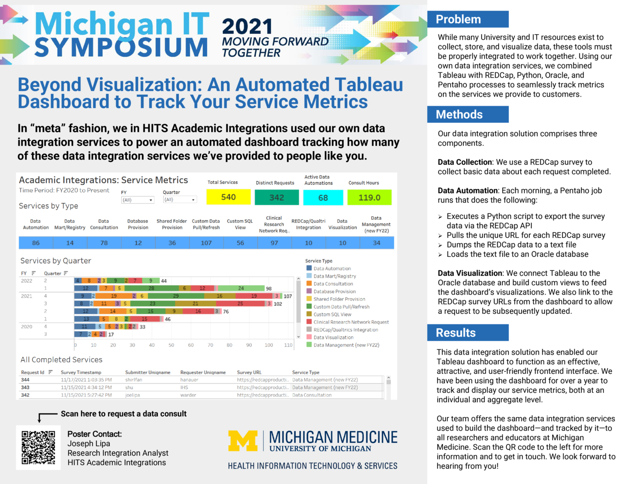
While Tableau is often used simply as a data visualization tool, when combined with other University and IT resources, it can function as an effective and attractive frontend for tracking service metrics. In this poster, we in HITS Academic Integrations present an automated ETL pipeline integrating Tableau with REDCap, Python, Oracle, and Pentaho processes, which we have been using for over a year to track and display our internal service metrics at both an individual and aggregate level.
Development and automation of the dashboard made extensive use of our own data integration services currently available to all Michigan Medicine researchers and educators: data automation, custom data pulls and SQL views, Oracle database provisioning and setup, and custom data visualization. These services, among others, may be requested via our ServiceNow catalog.